First question, what makes a great event website to you?
“Of course, it is the one that gets people to sign up for my event.”
Absolutely. A powerful event website does more than just keeping people on your page. It convinces prospective attendees that you’re the event for them, turning these page visitors into excited attendees. So how can you design an event website that looks appealing and stimulates a sense of excitement in them?
To build a sophisticated event website that does the educating and entertaining job, here are five event website design tips that we think could help maximize registrations:
- Bold Statement Colours
- Broken Grid Design
- Creative and Entertaining Video Content
- Maximised Simplification
- Replacing Contact Forms with AI-Powered Chatbots
Bold Statement Colours Totally Nailed It
It comes at no surprise that bold, bright colours have an enormous impact on mood and later the conversions. A splash of a bright hue on your event pages can mean a whole lot difference between an effective event website and an ineffective one; it can boost a page visitor’s interest towards your event.
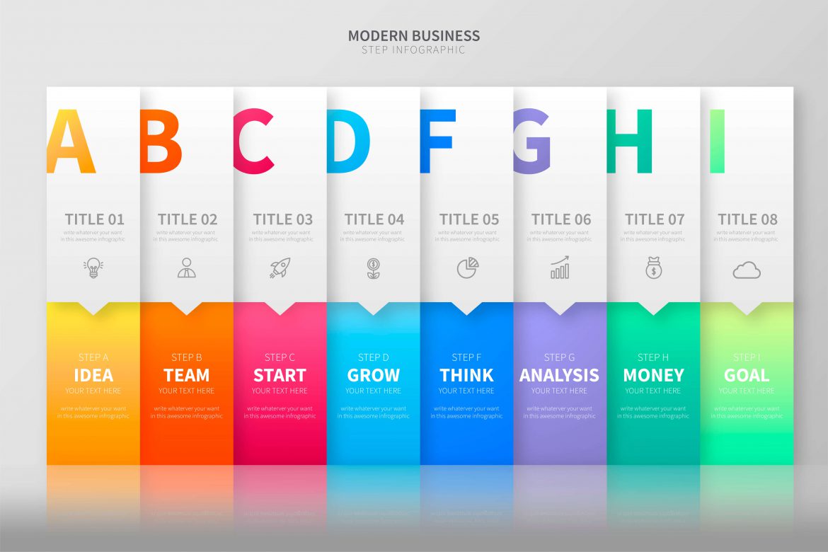
Yet, each colour entices a different psychological response, and it’s vital to learn the nuances between them to achieve the desired effect. You must have realised the norm whereby brighter tones are usually seen in event websites targeting men and a softer tone for women. But if you’re trying to outstand other event websites, you would want to consider using colours that visually pack a punch while designing your event website.
Daring shades of teal, electric purple, and even humble yellow are among the best colours for websites this year. While you do your design, always keep to the general rules; dark coloured text on light backgrounds or vice versa; colour combinations that contrast well together. Bad combinations such as red text on a green background is totally a no-no.
Showcase Your Event With A Broken Grid Layout
Besides choosing the right colour scheme, coming out with a creative event website design can be challenging. Yet, it is one of the most effective ways to leave a deep impression on your prospects.
Use a playful, broken grid layout in place of your typical, boring symmetry layout to attract eyeballs. From typography to layering, you can customise your broken grid design for it to look purposeful and cool.
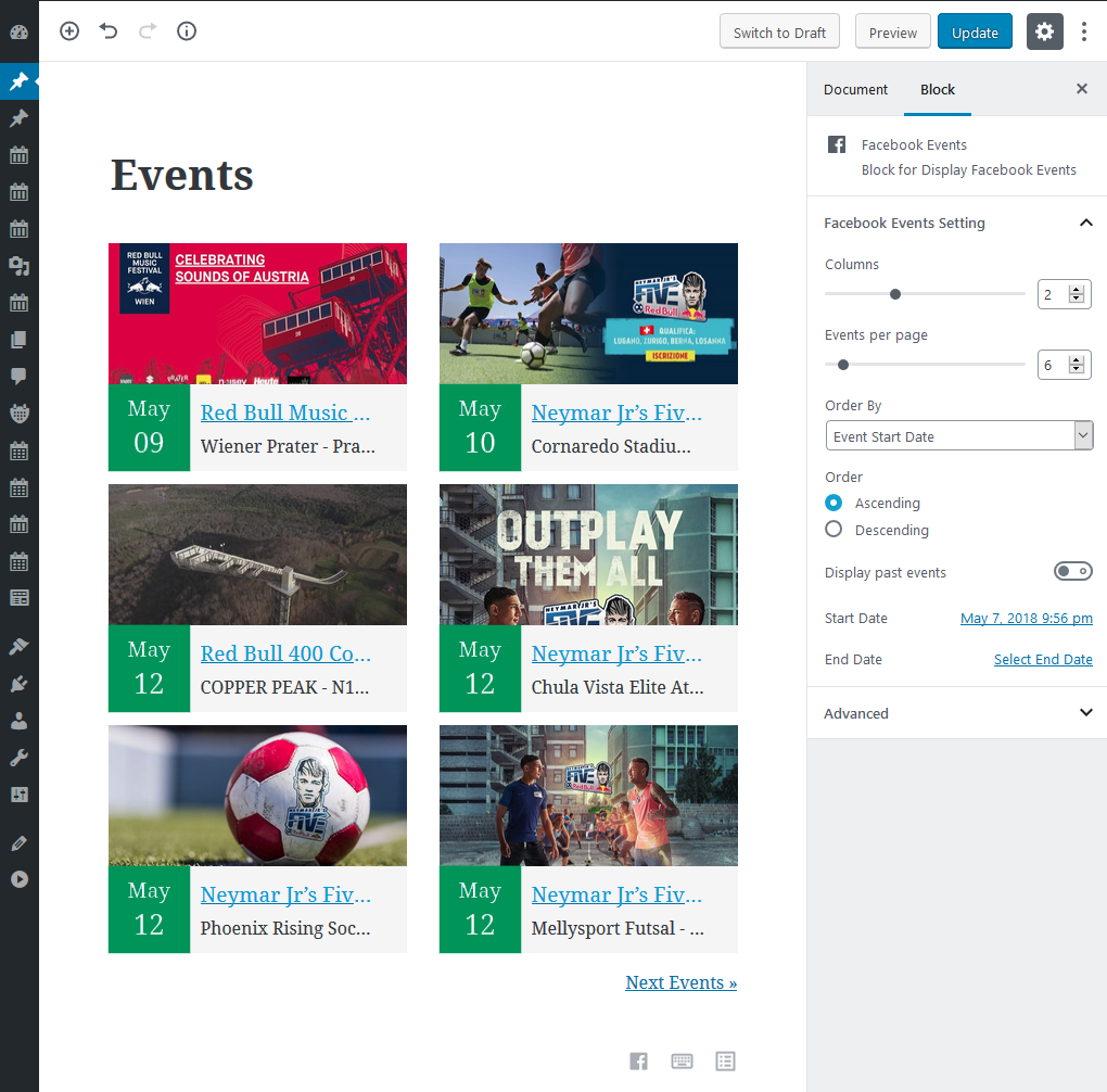
Bear in mind that font plays an important role in event website design. Hence, decide the text font, size and placement wisely and creatively to entice event signups. While for layering, go ahead and play around with what element to be brought forward and which to be sent back. You may even utilise different shapes and frames to structure your website, adding depth to the overall image.
Event Video Is A Big Deal
In the past few years, the use of graphics in event website design was emphasised. Pictures of your event venue, images of guest speakers or snapshots of interesting activities were encouraged for potential attendees to embrace your upcoming event. However, video content has slowly gained its momentum recently along with the rising trend of YouTube, Instagram and TikTok.
A lot more engaging than text and photos, videos offer viewers more: movement, dialogue, facial expressions, and consequently, more emotional resonance. If photos record the best moments of your previous events, videos capture the truest and the most authentic moments. Videos handily beat photos in providing viewers with a glimpse into the event experience.
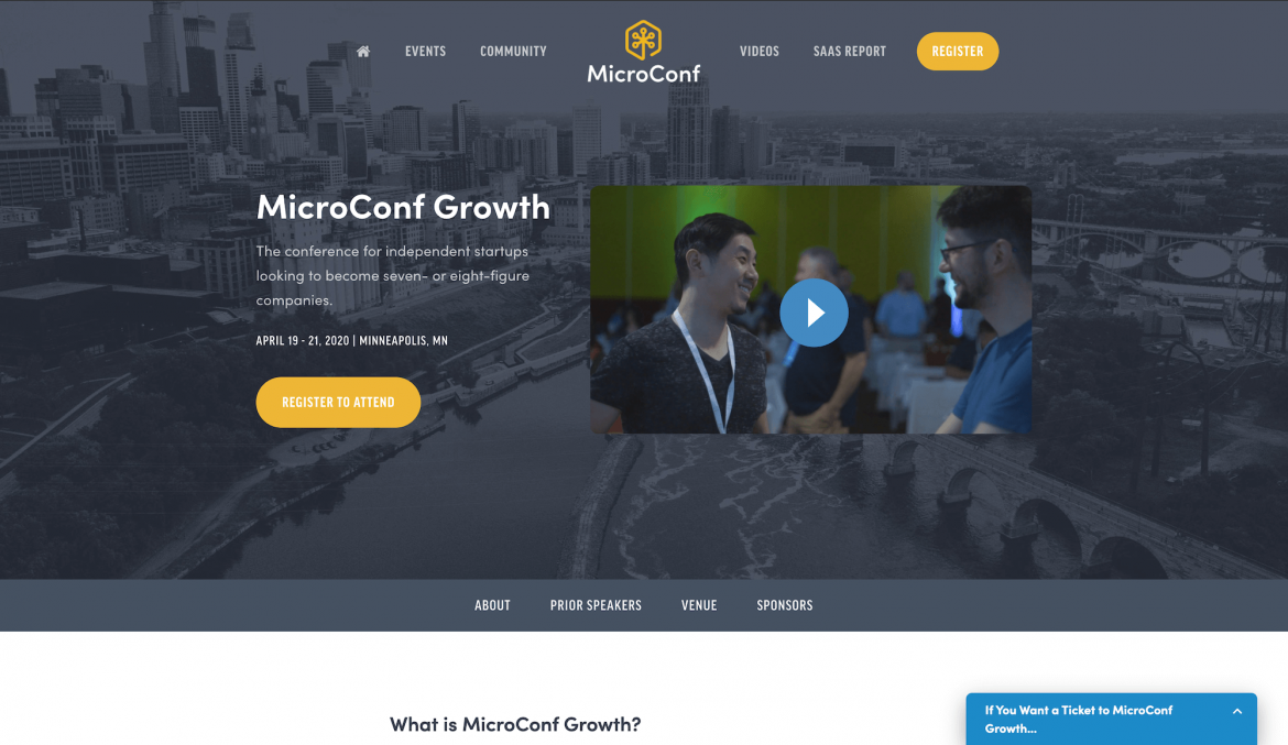
While text requires reading and photos require a bit of imagination, videos speak for itself. Videos give page visitors the opportunity to learn more about your event and they do a good job of conveying the personality of your organisation.
But, try and limit the length of the video as it can be a big turn off. Not to mention, the content must be creative and engaging, from video testimonials, interviews with keynote speakers to informal blog-style videos that can feature tours of your venue.
Keep Your Event Website Design Sweet and Simple
Copy and content are important, but where do you think potential attendees go next? Looking for a way to join. To drive your ticket sales, be sure to use simpler user interfaces, fewer navigation or button options, and an overall more streamlined journey.
A clean and easy-to-navigate event website design can effortlessly walk them through the decision-making process. Be clear of what information you need and leave out those unnecessary ones. Remember this, the more questions you asked, the more clicks it takes to close a sale, the more excuse your prospect have to walk away.
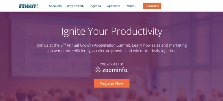
Your event website design should bring relief to all of our eyeballs moving forward. Once someone has decided to join your event, don’t let a frustrating ticket purchasing process make them second guess their choice. According to the research, each step in the checkout or registration process results in a 10% reduction in transactions.
Try this and you will see higher conversion rates in your next event.
Goodbye Contact Forms And Hello Chatbots
With digital form replacing traditional paperwork 20 years ago, digital form has now faced a crisis of being eliminated. Out with the old and in with the new – AI-powered chatbots.
In today’s world, people are increasingly pursuing technology and has become more tech-savvy. They would rather go for a quicker, more accurate option – chatbots to avoid the hassle of filling up contact forms. Chatbots provide a more human experience for online users as chatbots are proactive in engaging page visitors as they initiate conversations.

Without the need of being handled by human agents, AI chatbots can operate on its own once you integrate both close and open conversation scripts into the chatbot system. They’re proven by numerous research to streamline inquiries and even boost conversions.
In addition, its 24-hour service is seen as its best feature in delivering quick response and prompt service. For any query regarding the event, your prospects do not need to wait for reply “WITHIN A BUSINESS DAY” to get simple questions answered.
And the best part is they’re pretty affordable. Hence, it is definitely a why-not for your event website design to avoid losing potential attendees and ticket sales.
Want your event website design to make an impact?
It looks like you’re all set. We hope you’re enjoying these 5 event website design tips we’ve gathered for you. If we can help you with anything, get in touch with our experts at +603 8408 2112 or drop us a message through the Event Web Design landing page. You can also have all your questions and concerns addressed when it comes to organising and managing the best possible event with Evenesis.


